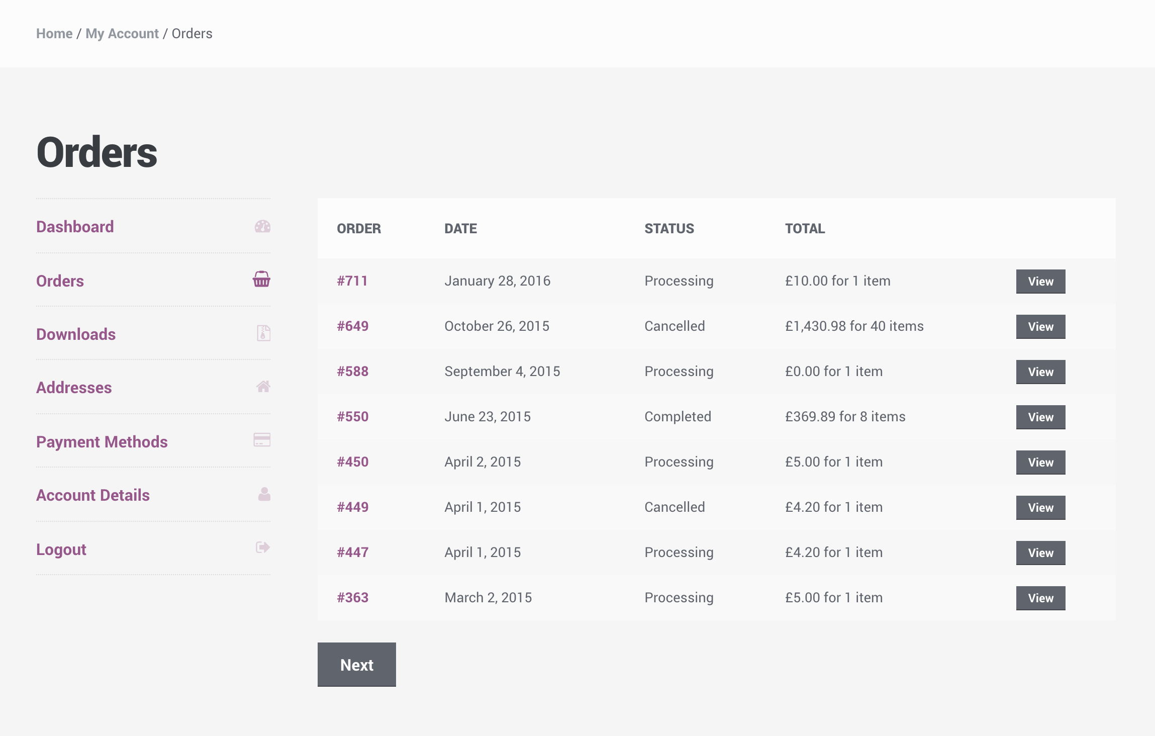
The “My Account” pages in WooCommerce are highly important for customers as it’s where you can access orders, available downloads, and address/account information.
Plugins can also add data to the account page if they need to, such as Subscriptions and Bookings. Because of this, a lot of things can be happening on this one page. This can lead to the page being heavy (it is not cachable) and confusing.
We are pleased to announce that in WooCommerce 2.6 we are introducing a new “My Account” page where all the content can be split into menus and pages, allowing customers to navigate between content without viewing all data at once.
Here is an example of the navigation using the Twenty Sixteen theme:
Note that each table and/or session of the old “My Account” page is now part of a menu and we’ve improved some things such as the “Orders” page where you can now access all past orders and not just the latest 15.
The design will be dependent on your theme of course – this is an example of how Storefront is styling things for even more clarity:

Code Changes
Templates were changed, such as the my-account.php file, however we’ve maintained backwards compatibility with themes and plugins. If you have a outdated version of the my-account.php file you will see the page as it was previously.
Plugins can continue inserting new tables on the page like before, but they will appear on the first menu item which is now headed as the “My Account – Dashboard” page.
Inserting new tabs in the new “My Account” page
Adding new tabs is possible with code and will involve adding new endpoints to WordPress. The code below describes how this is done:
Testing it out
The code is available to test on our master branch until we tag beta 1. We welcome your feedback and hope you like the new page!
Leave a Reply