A new product gallery coming to 2.7. Maybe.

The product image galleries in WooCommerce basically haven’t changed since version 1. The layout is fine, but the lightbox functionality is looking more than a little tired.

Most importantly the experience on smaller handheld devices is terrible. We’d like to replace the lightbox functionality entirely with a carousel/zoom combination which will provide a lightweight, intuitive experience for both desktop and handheld devices.

Why?

Just so we’re on the same page as to exactly how terrible our current implementation is for small screens check this out;

That’s right, the image that appears in the lightbox is actually smaller than the image displayed in the page itself.

Of course we could just disable the lightbox for small screens, but without a carousel it wouldn’t be possible to see the additional images at a size any larger than the small thumbnails. We need another solution.

How do we propose to address this?

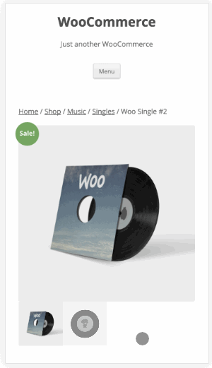
I think we can agree that the lightbox is pointless on small screens. What works very nicely is a carousel with touch support to easily swipe between images. Something like this:

carousel-mobile

I don’t expect many WooCommerce users to be opposed to this change. What I’d really like you to consider is how our galleries behave on desktop.

Desktop

We’ve agreed that a carousel is better for mobile. I happen to like the carousel for navigating the gallery on desktop as well. We’re already loading the script for mobile so it makes sense to use it on desktop too.

The question then becomes; How do we provide the ability to see the image in greater detail? There are a couple of potential answers to that question each with it’s own pros/cons.

Lightbox

The pros of using a lightbox are that it is familiar. It’s what we have currently.

But that’s about it.

The cons are several

  • Lightbox scripts are fairly hefty and include a lot of functionality that we don’t really need
  • Generally require additional assets (css) on top of the js
  • Given we’ve agreed that a carousel is the way to go for gallery navigation, it’s somewhat counter intuitive to have that method of navigation in addition to lightbox gallery navigation

Zoom/magnification

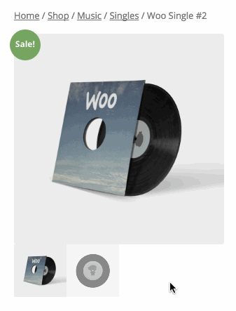
Zooming in on the main product image as you hover over it is an alternative option. Here’s how that would look;

carousel-desktop-zoom

The pros

  • It provides a very intuitive overall experience. You click the thumbnail you want to look at then simply hover over the main image for more detail.
  • It’s lightweight. Including CSS, PrettyPhoto (our current lightbox script) weighs in at 30kb. The zoom script is 6kb. That’s an 80% decrease!
  • It’s consistent – the desktop / mobile experience mirror one another.

The cons

  • This solution is dependent on the theme to display the product image at a reasonable size. If the image is tiny, zooming might feel a little awkward.
  • It’s different. Not sure this is necessarily a con but it’s a very important to consider for store owners. Changes like this do have the potential for disruption.

Both

I really wouldn’t want to do this, but it is of course an option to have zooming and a lightbox.

Over to you

What do you think? We’re very keen to hear feedback on this idea, in particular on the desktop behaviour.

If you’d like to actually test this functionality please check out the add-product-galleries branch on github. It goes without saying that you should only do this in a development environment.

Please vote in the poll!

[polldaddy poll=”9500318″]

A note to theme authors

This change involves template changes to templates/single-product/product-image.php and templates/single-product/product-thumbnails.php as well as the addition of two new scripts and a little css. If you dequeue WooCommerce styles in your theme and roll your own, you’d need to add some css to support the new gallery.


38 responses to “A new product gallery coming to 2.7. Maybe.”

  1. bradkgriffin Avatar
    bradkgriffin

    Great work Jeff!

    Now in the polling and feedback of responses for the end users to comment and provide their opinions, can we possibly set up a live demo for store owners to test the carousel themselves?
    ….on *their* different phones and tablets?
    For the “Greater Good”, and for proper votes, store owners will be better equipped to give accurate feedback if they have a working demo.

  2. Hello James,

    Thank you for this change. I am not a great fan of zoom/magnification. Not all types of products require a zoom. I am not a big fan of lightbox either. I’d suggest to have the same carousel functionality in the desktop.

    I have implemented this in our latest Electro theme ( we have carousel + lightbox instead of carousel + zoom ) : http://demo2.transvelo.in/electro/product/ultra-wireless-s50-headphones-s50-with-bluetooth/

    Thanks,
    Ibrahim

    1. Disabling zoom would be very straight forward.

      PrettyPhoto would still be registered (some extensions rely on it) so you’d be still be able to enqueue it in your theme.

  3. The most important thing first: Customers want to zoom into the images on mobile too! They want to see every detail in the image as good as possible. So thats NOT a thing that should only be implemented for desktop users.

    We are using something like a hybrid between zoom and lightbox on our woocommerce shop. Its called PhotoSwipe: http://photoswipe.com/

    See it in real life on our page here: https://kilenda.de/shop/mode/oberteile/shirts/longshirts/joules-langarm-shirt-kopfloser-dino-grau-2/

    The best thing about this approach: It feels perfectly integrated on mobile, because you can swipe up/down like on facebook to close the lightbox, you can swipe right/left to get next/prev image and you can pinch to zoom in/out.

    On desktop that can all be accomplished with clicks. So it is the perfect hybrid for us! You should consider using this solution too 🙂 Our customers love it.

    1. Photoswipe is very nice but it really bugs me how you have to ‘open’ it before you can start interacting with the images. It’s not at all obvious that you can pinch to zoom either although that is a nice feature.

      1. What do you mean by it bugs you how to open it? Normally you tap/click on the image like in all other galleries/lightboxes. Or what do you mean?

        The biggest thing you shoud keep in mind: Nobody wants to look on small images on his smartphone. Almost all of our customers demanded that they want to zoom on the phone too. The zoom feature of photoswipe is there the most natural approach to what a smartphone user would expect.

        1. > What do you mean by it bugs you how to open it? Normally you tap/click on the image like in all other galleries/lightboxes. Or what do you mean?

          I’m talking about how you _have_ to tap the image first before you can start swiping. Maybe it’s only a minor thing, but I just want to be able to start swiping without having to ‘open’ the ‘lighbox’. Make sense?

          Like I said, PhotoSwipe does look very nice and I’m quite keen to give it a test. The poll results are hardly swinging in one direction or the other in any significant way so having the two options to compare could be handy.

      2. bradkgriffin Avatar
        bradkgriffin

        Wow. I gotta say that the photoswipe option is really pretty sharp looking!
        James, even though “It’s not at all obvious that you can pinch to zoom….”, adding a visual prompt could easily very clarify that “behavioral” aspect.

        Both on mobile and on desktop, the photoswipe affect is really going to bring out product images SIGNIFICANTLY!

        Please take extra note that the photoswipe doesn’t leave the option of having to decide or vote on “one option” or another for a carousel or lightbox on mobile or desktop. It simply WORKS on ……BOTH 🙂

        While I know Jeff and the team have put some work into making new options for product images in WooCommerce, Photoswipe looks like a real winner ~ for everyone!

  4. Marlon LA Avatar
    Marlon LA

    I think this should be decided by the user because some of these options may not make sense based on the product type. So I voted both.

  5. Is the light box being pointless on small screen the LB or how it’s styled? I think a case can be made for a full screen (?) LB that uses as much screen real estate as possible. The same could be said for large screen as well. Remove distractions and go big. Maybe?

    1. I think a case can be made for both, depending on the store. Using as much screen real estate isn’t necessarily good, having the move the mouse a long way to close the lightbox can be fiddly.

      The more I think about this the more subjective it appears to me. That doesn’t help in coming to a decision!

  6. http://demos.iconicwp.com/woothumbs/product/vest-cube/
    Luke pointed this one out as well. When I bring it up on my phone it looks just as sharp as on the desktop.

    What’s the “best” part about this one? Well… remember the comment about wanting some better “visual cues”? These folks have done a somewhat good job of addressing that aspect.

  7. Luke Cavanagh Avatar
    Luke Cavanagh

    I do like how this demo example functions

    http://demos.iconicwp.com/woothumbs/product/vest-cube/

    But it was more on how the magnify and next image functions.

    1. Good example of Zoom and Lightbox working together 🙂

    2. Marlon LA Avatar
      Marlon LA

      Great as this way puts the power of decision in the user’s hand, he chooses how to view the image.

    3. jamesckemp Avatar

      Thanks for being a brand ambassador, Luke!

  8. I guess this also depends on product type. Some might benefit from small window/zoom paradigm on a big screen, while other products will get a much bigger impact with a big image on a big screen. There are also other considerations than pure size, placement of close button (on image, click on image, display corner), placement of right/left arrows (on image or at display edges), overlay or not etc.

    From a shop owner perspective the discussion seems a bit technically focused, the key question of course is what impact does the choice have on conversion on big screens. And that ofcourse is not subjective, that could be tested with proper A/B testing etc. I’m sure many Woo stores have done A/B testing in this space that could be relevant, would be nice if someone volunteered the data, the problem is perhaps that those people hang out on marketing sites more I suspect.

    Personally I think that not providing a “big image” option (lightbox or something else) would be detrimental for conversion for some types of products (guesses: clothes, furniture, travel etc). Other such as mobile phones, cameras and other small goods would probably not see much of an impact.

    H

  9. I voted for zoom just because I see that as more of a need from my experience, but I would have voted for D, none of the above. Woo is so versatile that choosing A or B is so hard. I also say, if it isn’t broke, why fix it? Couldn’t these additional functionalities be sold as optional plugins for folks that want to use them?

    1. Hey,

      > I also say, if it isn’t broke, why fix it?

      I’d say it is broken. Take a look at the experience on mobile currently (highlighted at the beginning of this post).

  10. frydmania Avatar
    frydmania

    Hey James, great work by the team – exciting stuff!

    We get quite a few comments that users expect an arrow to show to the left and right of an image and will click on that. If it’s possible to implement that as well as the mouse over zoom, that would be great. Or have the option to have one or the other.

    A desktop option to increase the size of the whole image set including thumbnails, eg to fill more of the screen and have captions for each image would be very useful, but I suspect not a consideration for core. Good for SEO though.

  11. Joe Hana Avatar

    This kind of feature should be only theme-specific. I do not really it, get why always messing around with the frontend templates. There aren’t enough hooks to customize every aspect, and when choosing to customize by template overwrite we (theme devs) always need to par up with the woocommerce updates. Just leave this to theme authors, or as a plugin extension and please focus on backend improvments (admin ui, checkout options (like new shipping methods)…

  12. Zoom sounds nice! ATM for our theme we’re using zoom / magnification instead of the lightbox (jquery-zoom + flexslider). Here’s an demo example:
    https://pinpossible.ethemez.com/product/nice-black-shoe/

    If the original image is too small a zoom is not possible (otherwise it would zoom out):
    https://pinpossible.ethemez.com/product/silver-ring-with-light-purple-stone/

  13. And what about fullscreen zooming on mobile devices with touch gesture detection? This way you could fullscreen any image and scroll within it with your finger, so you can move the image.
    Desktop I would let the gallery lightbox

    1. Maybe you mean something similiar to what I mentioned in my comment above?

      We are using something like a hybrid between zoom and lightbox in our woocommerce shop. Its called PhotoSwipe: http://photoswipe.com/

  14. Gerd Neumann Avatar
    Gerd Neumann

    I think http://babich.biz/mobile-ecommerce-product-details/ is a very nice read-up on mobile UX for webshops. It also has a section about “Design Your Image Gallery for Horizontal Swiping” and other very good ideas (some of which WooCommerce does not support atm unfortunately).

    (Disclaimer: Not associated with it at all, but found the article eye-opening. Seen it via Hacker News at https://news.ycombinator.com/item?id=12331225)

  15. Quick update on this. We’ve added photoswipe to the previous iteration and we’re pretty happy with the direction this is headed…

    Seems to offer the best of both worlds which looking at the poll results is what folks are looking for.

    1. This looks perfect. It will be super nice to have this in core.

      Keep up the good work!

    2. Yay! Good call!! The only thing I’d like to add at this point is to ensure as many of the functional parameters are made available in the admin panel as possible. The tendency to hide things to prevent noob confusion really impacts on devs with a modicum of experience. Exposing (too) many of these variables will minimise the need for hacking (action and filter mods), which IMO in turn reduces the overall support load in the forums

      I was a total noob a couple of months ago and I can confidently say that it’s far better to understand the framework than be at the mercy of plugin authors that only partially solve problems or haven’t the time or inclination to keep up with WP developments. However, I can also confidently argue that greater exposure of customisable parameters shaves days and weeks off development time AND eliminates the motivation for the production of half-baked plugins. Am I being negative or is the WP plugin repo 70+% rubbish?!

      1. Our (and generally the wider wp communities) philosophy is to make decisions rather than offering options.

        In our experience, more options definitely leads to more confusion. Especially when you start to consider how the interactions scale when more features offer more options.

        So like many other WooCommerce core features, the options will be there, but most likely available via filter/actions/templates.

        Did you have something specific in mind?

        1. Not at all. I was making a general point about the exposure of parameters, but with particular emphasis on the forthcoming implementation of PhotoSwipe.

          I entirely take your point and you certainly have waaaay more experience than I could even dream of, so I’m not gonna argue this one with you!

          I just think conceptually it’d be advantageous to aim for the middle-ground where the majority of useful devs reside – i.e.: the guys and gals who don’t get confused or frustrated and have a great deal of intuition to draw from. They’re the ones whose workflow benefits from instant access to tweakable parameters from an admin console. They’re also more in touch with their original noob selves and thus more capable of fielding questions. Devs such as yourself shouldn’t need to waste time with noobs; I for one am incredibly grateful for your contributions, but I also see it (now) as counterproductive.

          Look at it as a “trickle-down” economy where the currency is code; you are the 1%, but (thankfully) you don’t keep all the code for yourself!!

          1. Thanks for the response.

            I reckon we can hit that middle ground with a plugin if necessary 🙂 IE a free plugin on .org that adds settings to WooCommerce that interact with our lightbox/carousel/zoom filters.

            I suggest posting this idea on our ideasboard (http://ideas.woothemes.com/forums/133476-woocommerce).

  16. jens1979 Avatar

    I think that the alternate images should be next and not below the main image. On Desktop you have more space horizontally than vertically. The product tabs are often below the fold and only visible after scrolling.

    1. That’s something you can tweak very easily with some CSS 🙂

  17. Fabulous…. I really like Zooming feature of that. It’s really awesome and elegant. It’s really good to know the pros and cons of Zooming but at the end, it’s really worthy aspect.

  18. bradkgriffin Avatar
    bradkgriffin

    http://prntscr.com/cejjbr

    The left / right arrows are going to need some size adjustments so that they are visually and aesthetically more prominent and eye catching.

    Other than that one little tweak, it looks great !!!

    1. We can tweak that in our skin but you might like to raise that issue on the Photoswipe repo 🙂

  19. […] of this blog will know that we’ve been talking about the possibility of revamping our product gallery display on single product pages. This post […]

  20. […] of this blog will know that we’ve been talking about the possibility of revamping our product gallery display on single product pages. […]

Leave a Reply

Your email address will not be published. Required fields are marked *