WC 3.3 Order screen changes, including a new preview function, ready for feedback

As part of the 3.3 release cycle we’ve been working on adding some features to the order screen, and improving general appearance.

First let’s take a look at the current order screen and point out some issues.
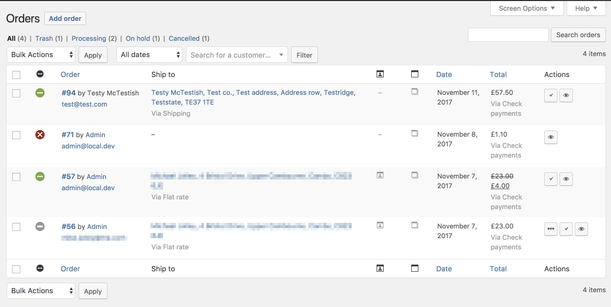
old
Order screen in 3.2

Problems:

  • Status icons are only used on this screen, and have little meaning or context.
  • Action icons are similarly confusing, largely due to the icons having no real meaning and being open to interpretation.
  • Showing addresses here is of little benefit since you cannot fulfil orders without knowing whats inside.
  • Other data that isn’t really needed here (because you cannot do anything with it!); payment method, shipping method, columns for notes with nothing but an icon.

Additionally, viewing order items was something removed in a past version due to performance reasons, but was missed by some users gaining > 150 votes on the ideas board. We wanted to introduce something more performant in 3.3.

The new screen takes design cues from Store on WordPress.com (which was redesigned from scratch) and aims to simplify these views, as well as do code cleanup behind the scenes. This is the re-factored screen:
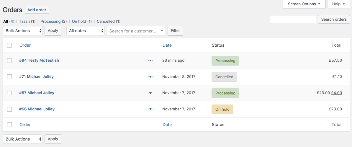
new
Proposed order screen in 3.3

Key differences:

  • Revised which columns are shown by default. Shipping address/billing address can still be toggled on, but are hidden by default.
  • Combined order number/customer name into a single column with the most important data.
  • Hidden the actions column unless an extension uses it to add custom buttons. All previous order update actions are possible from the bulk actions drop-down.
  • There is a new preview link for viewing order contents.
  • Clicking any part of the row takes you to the main edit order screen.
  • Statuses are text-based, and hovering the status reveals any important notes. Using words makes it clearer, especially for new users.

The new preview button you may have noticed brings back a view of items in the order, but does so without slowing down the page load. Order details are loaded via AJAX and display in a modal like this:

preview.png
The order preview

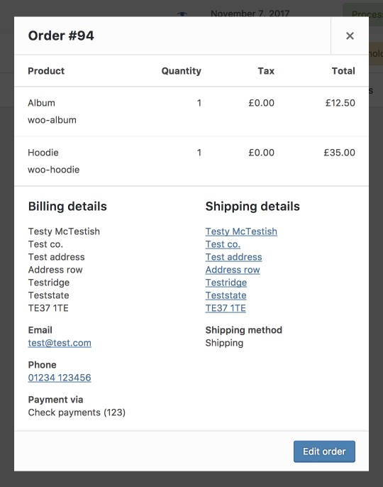
Now you get all the add-a-glance information needed to deal with new orders without needing to edit the order.

Testing and feedback

These changes are merged into our master branch on GitHub if you want to try things out. If all goes well, they will be part of 3.3 release in January.

Thoughts and feedback welcome in the comments.

74 responses to “WC 3.3 Order screen changes, including a new preview function, ready for feedback”

  1. simbahosting Avatar
    simbahosting

    This looks like a very positive change.

  2. bildmanufakturwackernah Avatar
    bildmanufakturwackernah

    But were will extras be shown like pdf order receipts which are now as icons on right in list?

    1. bildmanufakturwackernah Avatar
      bildmanufakturwackernah

      Ah, I have seen that you include them under actions. Thanks. Looks really nice.

  3. I’m glad you finally did this and removed the unnecessary clutter. For a while now, I’ve been removing columns programmatically for client installations and it’s good to know I won’t have to do that any more.

  4. The more scannable order statuses is definitely and improvement. I love when the core gets updated and less custom workarounds are needed 🙂

  5. Worlds Dream Avatar
    Worlds Dream

    It looks great. This is a nice update when released. Keep it up. Love the simplicity.

  6. Hi Mike,

    Great progress so far. Few things I wanted to note:

    1. Will it still be possible to add our own columns to the main list? Our company produced a wholesale extension for Woo called Wholesale Suite, the pricing extension adds an indicator to the list if the order was Retail or Wholesale which our users find very handy.

    2. Filtering – similar to #1, we’d like to provide filters.

    3. The order details ajax driven Popup – I’d like to ensure that you make the table with order items a scrollable div 🙂 Wholesale orders are often huge with hundreds of items. That view would be unusable if it extended off the page. Also… larger than 2 rows would be great! I guess you could size popup this based on the viewport and give the item list around 30% of the space or something.

    4. Can we please ensure the ajax driven Popup’s content areas are filterable so we can add extra information if needed.

    That’s all I can think of for now! Let me know if you need me to raise tickets for any of this.

    We’ll be early beta testers for sure 🙂

    1. Hi Mike,

      Sorry, one more feedback item to add:

      We just noticed you mentioned “Clicking any part of the row takes you to the main edit order screen.”

      I think this is a bad idea as it will be easy to mistakenly click where you aren’t intending, such as if you’re trying to use the ajax driven popup preview and it navigates away. Just a UX thing.

      Likewise, it’s different to what people expect from WP interfaces where they’re used to clicking on the Name column (such as with Posts).

      I think people would be fine if they just had to click the combined ID/Name column to get to the order edit screen.

      1. Column filters and actions are unchanged, and we have added filters in the popup.

        > I think people would be fine if they just had to click the combined ID/Name column to get to the order edit screen.

        We had some user testing a while back I believe showing people missing this. If you recall, we added that ‘view’ icon in the actions area but tbh having the entire row clickable makes the most sense to me. The preview button has a border and large clickable area so should be clear.

  7. In our warehouse we have this overview on permanent display so it is of great importance to us. The most used feature are when the order gets a shipping label and then we click the tick which finishes the order: sends an email and captures the money. I would really miss the ‘finish order’ button!

    1. It’s available in the bulk actions; you can do a bunch of orders at the same time.

  8. testbusterspagamenti Avatar
    testbusterspagamenti

    The new feature coming in woocommerce 3.3 it’s not the same thing as before, you still need to click each order to know what’s inside or the shipping method. This is time wasting for shops that process hundreds of orders a day. With the old order screen you could identify orders with the same content in the same screen. This is really important because if your orders have often the same content you can prepare buffers. With this new screen you can’t because you don’t have an overview of the content of each order on page. You have removed the loading, but that was not the main problem…

    1. Maybe you’re remembering it wrong because the old order items column still required click to view items.

      1. testbusterspagamenti Avatar
        testbusterspagamenti

        Yes, but you could open all the orders in the screen and have an overview of all orders opened…

        1. If you sat there clicking every single row maybe, but even that lacked information about the order – it wasn’t enough to fulfil it.

          > You have removed the loading, but that was not the main problem…

          Loading all at once is why the old view was removed. It was not performant. AJAX avoids those problems. Would you rather there was no preview at all?

          1. testbusterspagamenti Avatar
            testbusterspagamenti

            “Would you rather there was no preview at all?”
            As i said, it’s the same thing, the workflow it’s the same. in < 3.0 you could see all the products in the order

            Optimizating Worpress and Woocommerce it's not simple, i understand, but this is a work instrument and you cannot waste working time just because the order screen had its limits.

            it's better seeing 10 orders instead of 20 and loading all the necessary informations to fullfill the order. A single loading time can fullfill many orders, you need to load the page just 1 time for many orders, now you use ajax to see the content of 1 single order. It's not efficient. Many employees working on pack orders means many concurrent ajax calls.

            This is my opinion, i created and i manage a website making millions a year with 3 employees making packaging… i think my company relies on efficiency very much. Thank you anyway for your work Mike 🙂

          2. ok, well since it’s the same (as < 3.0) I don't think any action is required here 🙂 If you need all details at once on the view, thats customisation territory.

  9. Just had some feedback from the ‘Shop Manager’ on our site.

    1. “I agree the action icons mean nothing unless you know what they do, but once you know… you know! Having to use “bulk” edit for despatching a single order seems counter-intuitive.”

    2. “Regarding moving columns such as the shipping – if we have 20 orders and 1 is next day, 2 are express despatch, we will have to click on every product (preview) to know which ones to expedite.

    1. R/e 1, how do they do this without first seeing what is inside the order? The items etc? Or do they ship then come back at a later date? Do they ship 1 order at a time?

      2. That makes some sense. Do they only find these orders via web interface, or use the order emails? The column can be toggled back on but we may have to add method back.

      1. Hi Mike,

        Thanks for the reply and apologies for taking so long to get back you. Here are some further comments from the shop manager.

        1. We print the delivery notes. Pick and pack the orders, then print despatch labels. At that point we click on the “complete” icon on the order screen. We don’t print, pick, pack, despatch each order separately with the order open on screen. That would take forever.

        2. We wouldn’t use order emails because again that would take too long, ie to find one express order out of 20 we’d be wading through order emails, paypal emails, low stock notifications…….. etc.

        Cheers.

        1. In that case you’ll be able to either a) enabled the actions column and use it as you do now, or b) use the preview window which will have the same actions present, should you also need to check order contents. I think that workflow won’t be affected.

    2. Since the shipping column can be added back and is off by default, added the method back to the list in https://github.com/woocommerce/woocommerce/pull/17814

  10. Edith Allison Avatar
    Edith Allison

    I’m looking after a busy wholesale shop and they need most of the current info. I’m assuming we can enable info as needed? In detail I would not want to lose “payment method” (as client offers payment by phone / on invoice); email address (as this is their main user identifier); shipping method (as international orders need manual confirmation of costs). For date, it would be useful to add time so it’s easier to distinguish multiple orders by client. Additional actions are in use for PDF packing slip; and the shop uses card processor results and EU VAT plugin. For preview, some orders have hundreds of items, so the length of preview window could be problematic, I assume it would scroll? Would be helpful to reverse order, so the client details are the top, edit button, and then product details follow. What I agree with are the icons – they are very hard to use and should be replaced with text, both for status and actions. Neither are “notes” of use as they are mainly stock reductions. I assume that smaller shops will have very different needs to B2B shops with large orders, so an option to customise would be great. I’m also on the Woo Slack group, happy to provide a real life example of the orders I’m working with if it’s of use.

    1. > I’m assuming we can enable info as needed?

      Shipping and billing columns can be toggled on via screen options. They contain the address and shipping/payment method. Hovering over total also shows payment method. Email is not in the list – it’s in the preview window.

      > For date, it would be useful to add time so it’s easier to distinguish multiple orders by client.

      Order numbers should be more useful for that.

      > For preview, some orders have hundreds of items, so the length of preview window could be problematic, I assume it would scroll? Would be helpful to reverse order, so the client details are the top, edit button, and then product details follow.

      It scrolls. Agree with placement – changed in https://github.com/woocommerce/woocommerce/pull/17814

  11. Really like the logic behind most of the changes. Of course, any change like this is going to have some undesired side-effects on users’ workflows/habits though. For a number of reasons, many Store Owners are quite used to go through orders using a combination of 1) keeping the Orders screen open in a tab/window and going back to it to use the Action buttons there, while 2) opening individual orders to look at something.

    This was encouraged by a number of small things done wrong, both in core and in extensions. There’s a lot to like here, but extension developers + store owners will need time to adapt. A couple technical comments:

    1) The html generated by `WC_AJAX::get_order_details` serves a very unique purpose. When store owners + developers get used to the new workflow, they will eventually want (or be asked) to add some extra data in there. To keep things clear, I’d start by moving the code into its own “view” file. Developers who are used to the WooCommerce way are more likely to look for this in `includes/admin/metaboxes/views/`.

    2) This piece of admin-facing templating code should have a lot more in common with `includes/admin/metaboxes/views/html-order-item.php` than with the customer-facing `templates/order/order-details-item.php`. Right now I can see some filters in there which are only seen in customer-facing templates, e.g. `woocommerce_order_item_visible`, `woocommerce_order_item_class`, and `woocommerce_order_item_name`. These are typically used by extensions to hide stuff or otherwise modify/style what the customer sees. However, the needs of a store owner might be different. A store owner needs to see order contents in a way that makes sense from a fulfillment perspective. A close look at `includes/admin/metaboxes/views/html-order-item.php` reveals there’s already a class filter called `woocommerce_admin_html_order_item_class` — that one seems like a good candidate for re-use here. The other filter names (or all of them) can be changed to indicate they are being used in “admin” and possibly “preview” context.

    Additionally, visually separating product from other (fee/shipping) line items would help here. A couple extra action hooks for rendering custom rows and/or content after each section (line items, addresses) could be very handy as extension developers could use them to add extra content or even UI elements.

    Previews have some great potential to replace the Edit-Order screen in many cases — catering for this from a coding perspective and encouraging developers to use them would help store owners see their value.

    1. Hey Manos,

      I don’t think we should encourage this as a full blown replacement for edit – it’s not intended that way. In the far-distant future there will be one edit/view screen IMO but we’re not there yet and admin is not performant enough for this.

      1) The HTML generated in main admin is not overridable either, but there are inline filters. Remember we don’t have a template system in the backend.

      It would be good to know where filters should be placed technically. We already have a `woocommerce_ajax_get_order_details` filter for the returned data, and action hooks in the JS backbone modal for rendering extra stuff.

      Feel free to raise PRs for this type of thing if you see a use case not supported. Bare in mind this is a preview and not a full replacement for the edit screen.

      2) Non-line items are omitted from this view. You mentioned to `woocommerce_order_item_visible` filter – the view is more inline with order emails than the edit screen. That filter is in use there too, and those emails are sent to admin FWIW 🙂

      1. > That filter is in use there too, and those emails are sent to admin FWIW

        E-mails sent to store owners are rarely used to fulfill orders. They only serve as a “notification”, and in this context it makes sense that the store owner should see what the customer sees in their own confirmation e-mail.

        The admin Orders screen is typically used to process/fulfill orders — therefore a preview should be as raw as possible, and match the “edit-order” screen as closely as possible.

        Knowing how customer-facing template filters are used by plugins, I think that the assumption that order previews should be consistent with store owner notification e-mails is not ideal IMO because these are two pieces of information serving different purposes.

        Such assumptions need to be validated with users before being rolled out. Pieces of feedback like this one are useful, but they don’t tell the entire story.

        > I don’t think we should encourage this as a full blown replacement for edit – it’s not intended that way.

        Definitely not. But as a former store owner, I think that the new preview has great potential to simplify order processing/fulfillment 🙂 In this sense, it’s meaningful to examine what store owners expect/need to see when fulfilling (not editing) orders.

        The only purpose of these changes/improvements is (should be) to make things simpler for the average store owner. “Things” in this context can only refer to order processing/fulfillment. Not having to “edit” an order to get basic information is a step forward anyway, so getting this right (as right as possible) from the start is a big opportunity.

      2. That in itself is not always true. I’ve definitely seen users try to fulfil/dropship with emails alone 🙂 There are too wide a range of use cases to really make everyone happy and suit all workflows exactly :p

        > Such assumptions need to be validated with users before being rolled out. Pieces of feedback like this one are useful, but they don’t tell the entire story.

        Without a user feedback group and those resources I don’t think we’re in a place to be able to do this. Even with a small group, that won’t represent the needs of all – just look at some of the comments to this post. There are some weird workflows I wouldn’t have anticipated even here – we’ll never get the entire story 🙂

        What I hope, and I think is valuable, is that the devs/store builders reading these dev blog updates can go to their clients/users and get feedback and relay that back as we’ve already seen above. This can make the first iteration as useful as possible, for a large set of end-users. With something like this, even if it’s *not* the perfect solution, it doesn’t affect current workflows because the edit screen is unchanged. We can always iterate this in future releases.

        If you have not already, go read the comments here http://ideas.woo.com/forums/133476-woocommerce/suggestions/18832222-dynamically-display-order-content-on-orders-page I’d say a lot of the users there are ‘average’ (if there is even such a thing).

        That column in 2.6 (which this is supposed to replace/bring back) lacked information for fulfilment. It was a simple list of item names and quantities. Yet with that, users were using it to fulfil things, somehow. This preview box is in the current state contains no less information than that 🙂

        I know you are thinking about bundles/composite products with this anyhow. I’m working on refinements in https://github.com/woocommerce/woocommerce/pull/17814 – we can look to adding **new** hooks for the preview box to control item output, but I don’t think the current edit screen hooks/templates are appropriate in this context and there may already be some odd uses of those current hooks which would insert too much information.

  12. Not having the date to review leaves us and I’m sure many shaking their heads. The date is super important. Who took it out and how do we get them fired?

    1. Not sure if you’re trolling but it’s the second column in the screenshot 🙂

  13. Only complaint or issue I can see with this is losing ‘actions’ being able to turn it on or off might do our deployments much better..

    See in multi user environments, we use a plugin that allows us to customise additional actions, and this has come in really handy for colour coded order picking status updates..

    so with multiple users in a warehouse environment the order pickers login to the back end and click the action that is their colour coded ‘person xxxx xxxx is picking this order’… that way when someone is picking it everyone else knows since all the order pickers typically use or share the same computer they also share and use the same login credentials sometimes too.. we’ve most of the times had multiple users except for a couple of cases….

    but none the less the “actions” have been very useful, I’d hate to see it gone for good.. love to be able to have it still there with it’s little icons and everything.. 🙂

    of course we also train our clients and make manuals.. so it’s never been an issue from a ‘user knowledge’ perspective since we equip end users with the knowledge and over view of the order screen and what nots..

    dig me?

    1. It’s still there.

  14. This is the tool we usually get our clients to buy.

    https://woo.com/products/woocommerce-order-status-manager/

    cheers, ENB..//

  15. adding the Images in preview would be great! it is must for big stores who have thousands of products

  16. I’m sorry to say this but these changes are awful 🙁 We’ve made a lot of customizations to the Order Screen which works for us quite well. I spent lots of working days to get there. Now it is completely refactored so I will need to redo all those customizations once more.
    I am starting to be fed up with WordPress/WooCommerce introducing breaking changes quite frequently. If it goes like this in the future as well, we will need to abandon the platform because maintaining and upgrading WordPress/WooCommerce is a real time killer these days.

    1. Saying something is awful simply because you made customisations is not really fair. These are not *breaking* changes. We’ve simply restyled and changed some *core* columns. Have you tested these changes?

      1. These are breaking changes in a sense that I will need to work in order to implement something similar that we have right now, ie. the same GUI as much as possible. This year I worked a lot on WordPress/WooCommerce just to make sure our site managers do not notice “any changes” that are introduced by each mayor update (at least those which are important to us). Actually, I need to work in order _not to have changes_ on the GUI/frontend side which is quite discouraging.

        1. That’s not what a breaking change is. A breaking change is a change in the public API which causes failure/error.

          Having to restyle some custom components is not breaking. That’s something you should have considered and factored in when you decided to customise the admin for the client- that it will need to be maintained. I’d be very surprised if your custom columns or additions actually broke in 3.3.

          If you and the client do not want any changes at all, do not update?

          1. We will update, of course. Since mayor WordPress security issues are discovered about every six months or so there is no option of not updating. But in reality that’s the only driving force to update. Our WooCommerce 2.x site was running without issues. There came major WordPress and WooCommerce updates so we were forced to update, I had to work on fixing and reverting some things and updating plugins as well. We did not gain anything except that I had to work on all this.

            Regarding the Order Screen: I’m not talking about customizations that are broken but features that are removed and I will need to reintroduce them, such as the icons of the Statuses. We use our own icons that we like and recognize easily, but they will be gone for good? Do we need to put up with those colored rounded wide rectangles? They take up a lot of space which is needed for our custom columns.

            There will be people who do not care and will not complain but for us it is additional work to figure out where to go from here, without any benefits whatsoever. Well, never mid, I will sleep less and work at night to redo some of these changes as much as I can…

          2. I think many users will appreciate text vs made-up-icons with no meaning. Especially new users who have not had training to know what icon maps to what status.

            If you insist on icons, adding a column back shouldn’t be too difficult but I’d ask is it really worth. Ultimately it’s your workflow so do what you need to do.

            > without any benefits whatsoever

            So no features added since 3.0 have benefitted you? 🙂

          3. “So no features added since 3.0 have benefitted you?”

            Quite frankly I cannot recall anything that benefitted our shop. Maybe it is because we only use free shipping and simple products and the only requirement is to keep it running the way it is.
            I understand that you want to improve WooCommerce but there are those who were quite happy with WooCommerce 2.x.

  17. Many customers do not use their full or real name when they order something (they use their business, their husband, a screen name, etc), so very often I must find an order by scanning for an email address. The email should be visible near the name as it currently is. Yes, I can search, of course. But often I just need to find an order that was recently placed and I could find it immediately by looking for the email address. This new simplified screen is making things more complicated. The email should be visible!

    1. First and last name are required billing address fields.

      1. Of course they’re required, but many, many customers do not use the same one for their order that they use when requesting customer support. Like I said, they use their Etsy shop name, their husband’s name, or some cute screen name. Frequently they are using a relative’s credit card. I wouldn’t have mentioned if it weren’t already an issue that I deal with. Hence my preference for the email address to be displayed, or at least visible with a hover.

        1. One thing all __customers__ do have is an order number. Is there something preventing you from requesting this?

          1. szilviahickman Avatar
            szilviahickman

            “Is there something preventing you from requesting this?”
            When customers write via a “Contact Us” form, they often forget about referencing the order number, for example. If it is a very recent order, not having to search for the order but simply spotting the email address on the first page of the Order List is very useful.

            I still believe that forcing the workflow _you think_ is useful for _all of us_ is a bad idea. You should have developed an easily customizable interface (click-and-play) instead of hardcoding something arbitrary.

          2. > I still believe that forcing the workflow _you think_ is useful for _all of us_ is a bad idea

            It should be a UI which accommodates most, rather than handling niche use cases. As long as it’s extendable.

            > You should have developed an easily customizable interface (click-and-play) instead of hardcoding something arbitrary.

            Columns can be added/removed with a small amount of code. List tables can be extended.

            In your case, requesting order ID as part of contact forms would not be difficult and it would be easier than manually scanning for email address which may or may not have been used to order.

            We’ll await more feedback before adjusting anything.

  18. Sorry if it was covered here, but where do you see the “order notes” that a customer fills out on the old version and the new? Is this the information that will show up upon hover on the new?

    1. Hovering the status.

  19. Having just gotten the the update…yikes. The new Order column looks terrible–why all that bolding, and where are the e-mail addresses??–and the Status icons have been replaced by bulky text buttons? Is this 1998? You’ve just wasted valuable screen estate with something so minor. I’m already working hard to undo these ridiculous changes. Whoever okayed these design changes needs to get a talking-to, honestly. I shudder to think of what this will look like when I try to view the order page on my phone…

    1. I understand design is subjective, but if you had feedback you’re a little late to the party https://woocommerce.wordpress.com/2017/11/16/wc-3-3-order-screen-changes-including-a-new-preview-function-ready-for-feedback/ But o well 🙂 Maintain your custom version. I’m sure it looks wonderful.

  20. “But o well 🙂 Maintain your custom version. I’m sure it looks wonderful.”
    This situation is not that funny at all. Many people will complain in the following weeks, I’m sure. I am one of those too, as can be read above. fencerx is simply right.

    1. If you have feedback or requests for the new views, you can log them on GitHub. But just saying it sucks like fencer isn’t constructive. Help us improve it 🙂

      1. I did not just say it “sucks”, actually I did not even use this word, I used “awful”. Anyway, I was too late to notice that this UI/UX refactoring has already happened. I would not even expect such a drastic change in the first place. If it was configurable so that we can sort of “revert” the changes by a few mouse clicks then these features would be welcome, however they are forced on us, and that is the main issue.

        1. Why are the changes awful? Maybe explain in detail. Have you tried the new preview feature there?

          1. I am the Lead Developer at an agency and having been on numerous WooCommerce projects, all recent changes are welcome. I see them as improvements. Some people are just stuck at a certain version and cannot comprehend any change.

          2. James Geiger welcomes recent changes because it is a great opportunity for his developers to gain more paid work from clients, as clients are sure to ask developers to revert some WC 3.3 order screen changes. But those who run their own shop (like us) will not get paid for any extra work, it is just a time consuming task for us.

            To see the answer to “Why are the changes awful?” please read bighippo999’s comment below and my previous post above, and also consider what I’ve written about the “unpaid work” we are facing.

            We have not yet upgraded because we are waiting for plugin developers to come up with easy to apply solutions. If we will need to pay for such plugins, then it is a clear sign of the loss we have to face. But testing an upgrading free plugins also takes time and free plugins are bound to be abandoned sooner or later. So we need to pay the price no matter what. I would not call this situation “great” or anything like that.

            “…cannot comprehend any change”
            Change is not necessarily good. I can comprehend (for example) death which is a kind of change. Do we need more examples the get my message through?

          3. Ok. We won’t be making any further changes or adjustments here without more feedback from other users.

            If you’re like to shape the direction of future changes, perhaps subscribe to this blog and work on giving constructive feedback. That would be appreciated.

            Thanks

  21. sorshawitch Avatar
    sorshawitch

    I need to see the mails too, how can we recover this?
    Thanks

  22. I used to hate working with WooCommerce as a developer but I like the new release cycle and 3.3 looks great. Nice work.

  23. I know I’m late to the party, but only just installed the update and now found this topic.
    This can be (is for us) a pretty big change to workflow, reading through the comments I don’t think we’re alone. So let me detail some specifics:
    Moving the Status column and changing it from icons. A cosmetic change, but the new way takes up more space. The icons were uniform and great for a quick glance once you know what they are, I can appreciate it being moved to text tells unfamiliar users the status. It may have been better if they retained the column position of first.
    The Date column, imo this needs switching back to a date. Seeing ’30 Mins Ago’ means nothing. How does anyone know if that is fresh data or yesterdays data (i.e page needs refreshing). At least seeing the dates was a good indicator your looking at yesterday and should refresh.
    We use (had to add back) the purchased items column, to quickly check which items have been bought. Then anything customised requires an email to the customer. This was a quick copy and paste, now it’s opening the preview window on each order to get the email address. While it’s not the end of the world it does impact us. I also agree with the comment above that it was handy when searching for orders. No customers do not always supply the order number when contacting. In fact there have been times where an email address has been mistyped and we fall back to searching postcode, but it was then very easy to spot hotmai.co.uk and no you can’t always go by the name if husband/wife/partner/whoever has ordered it. Believe me customers can be a nightmare and seeing as much detail as possible quickly saves a lot of searching. Being able to see the email at a glance certainly helped with DPA.
    Similar with the Notes column, it was a quick scan down the orders to see if the customer has added notes and deal with it. Normally via email copy/paste. It’s certainly not something that we can be previewing every order looking for.
    I do actually like the new preview window and I’m sure we’ll make use of it. The layout of columns will just take some getting used to but I would have preferred the changes to at least be more optional i.e put email in the screen options along with old/new status format.
    Anyway there’s my feedback (late I know), hopefully someone will at least pickup the date column.

    1. Your point about the dates becoming stale; if you leave the page open you’re still not going to see new orders as they come in until you refresh so I’m not sure why this is a problem.

      We could consider bringing email back, but I’m curious why you just would not search first? If you’re scanning for orders there is no guarantee it’s on the currently viewed page.

      1. Yes, but at least you’d see the orders as ‘6th Feb’ not ’30 Mins Ago’. Today being the 7th I instantly know it’s an order from yesterday and to refresh to see todays orders. 30 Mins ago only works if you know the page has been refreshed. It seems odd to me to make it relative to the latest page refresh rather than static.

        On the email, we do search in several different ways. Looking at the ‘processing’ queue is a form of searching, those orders then need checking, designs made, emails sent to customer, tick for bulk action to move queue. Much quicker not having to open the preview for each. We also Search by name, address, postcode and order number depending on need. As an example this morning I had a query from customer with no order number but have their postal address. They don’t have an order number as they typed the email address wrong hence no email from us with it. The name on the order only matches surname, being able to spot the mistake in the email address quickly may not seem important, but it takes a few seconds to open the preview now. Do that a few times a day, your wasting minutes. It all adds up.

        Actually on that front: the preview button doesn’t work for me after searching (looking at queues does). I’m not sure if this is a fault in general or just on our site. Have you seen this before? there’s just no response, no spinning wheel. So I had to open the order to see the email address in the above cmr query.

        1. This scenario with the email is exactly what I was referring to above. Customers type their email address incorrectly ALL the time and it causes endless trouble because they don’t have key information and then can’t log into their account to check anything because they’re not getting their password reset emails. And often I can’t find the order if the email was incorrect. Often, these frustrating customers have three or four accounts because they just make a new one when they can’t log in. Being able to visually scan down the order page for a similar email means you can find it in minutes. In five years of doing business, I’ve had a customer supply an order number fewer than five times. In a perfect world, the customer SHOULD do lots of things. But the reality is often very different. Being able to see emails matters.

          1. We’ll look into adding either a new column for this or to the name column. I’ll post a link for feedback when ready, not likely to be this week though.

    2. Seeing ’30 Mins Ago’ means nothing.

      Very good point

  24. Good change, really.

    I miss the option to access the user profile directly from the orders (before i just need to click in the user name and get straight to his profile in order to include him in some groups). But i think it’s just me.

    Keep up the good job!

  25. hi mike,
    another one late to the party trying to find a solution to bring back the speed of workflow we used to have with the old UI. we are a very small team with four figure orders per months, so basically every click counts!

    there are already some good points made in the comments, i also want to give you some feedback.

    – we are still not quite sure about the order preview vs. the old order-column. there are some pros and cons. currently we are slower in processing the orders than before but that might change when we have worked for a while with the new way.

    – not seeing the email-adresse at a glance is huge. this is the most important identifier for all kind of request and searches we process. we have a lot of subscription and renewals and for them order numbers are useless as we are only interested in the initial subscription number. names are way to often similar to use for search. so we take the email and use it everywhere. when customer contact us, they rarely now their order or subscription number

    – if an order has an order note we do not bulk-process the order as it need special attension. currently we don’t know if the customer left a note or not beside clicking on every single order.

    – status text takes way too much space for a not so important information. sure it is good for new users, but how long will it take to learn a few colours?

    – last but not least. if you have the shipping or billing column enabled you can not copy the address anmore because the entire line is clickable. so again you have to click on the preview to work with an customer address

    anyway thanks for your work and keeping woocommerce up-to-date

    cheers
    alfons

    1. R/e the addresses, those are also in the preview window which is the preferred way. You can copy from there.

      As for the icons:

      > how long will it take to learn a few colours?

      That learning curve shouldn’t be there. Plus those icons are only used in one place in the entire UI. Text is clearer, and as WC thinks about adding new statuses, possibly even separate payment/fulfilment statues, text makes more sense.

      1. Preferred way? Make us click for an information that I already see on the screen is certainly not a preferred way. We could easily fulfill an order without opening the preview. All I need is the price and address….if you just could copy & past the address

        Look at the WooCommerce App. The coloured icons are working just fine there as well to tell me the status. And if you are unclear you still have the option to hover over the icon.
        If it has to be text, why does it need to take up all this in your face real estate?

        1. Keeping copy/paste on column values is fixable. You’ll still need to know what items are in the order to fulfil though. Hence preview.

  26. So the original order screen (which, btw, I liked much more) had a “actions” table, where you could directly cancel an order. The new order screen doesn´t and the preview doesn´t either. Is there any way to cancel an order in the preview screen?

    My problem is that I accept Bitcoin only and cancel orders if they´re not paid within a special time frame. Now I have to get into every order directly to take this action.

    Any help appreciated.

    1. There was no cancel button in 3.2.

Leave a Reply

Your email address will not be published. Required fields are marked *