A couple of weeks ago we posted about an experiment we were working on to improve the product galleries in WooCommerce, particularly the mobile experience.
We laid out options to have a lightbox, a magnification/zoom, or both and included a poll to get your feedback. After 442 votes, the results of that poll look like this;
- Lightbox – 18.55%
- Zoom/Magnification – 51.81%
- Both – 29.64%
What do these results show us?
- The majority of folks (81.45% – ‘both’ voters + ‘zoom’ voters) like the zoom/magnification feature
- A significant number of people (48.19% – ‘lightbox’ voters + ‘both’ voters) feel that we need to continue including a lightbox
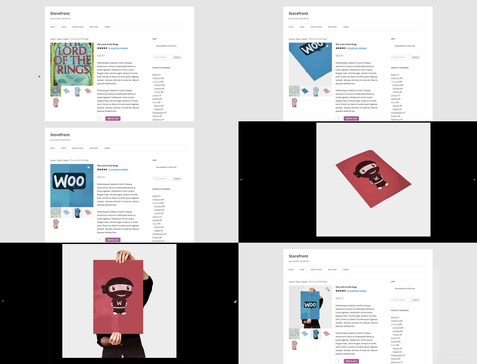
Based on these results and internal discussions we’ve decided to include both a lightbox and a zoom/magnifier. To do this we’ll use the popular Photoswipe script for lightbox functionality alongside our own Flexslider which handles the carousel/swiping on mobile. Zoom is our script of choice for zooming.
How does it look
A little something like this;

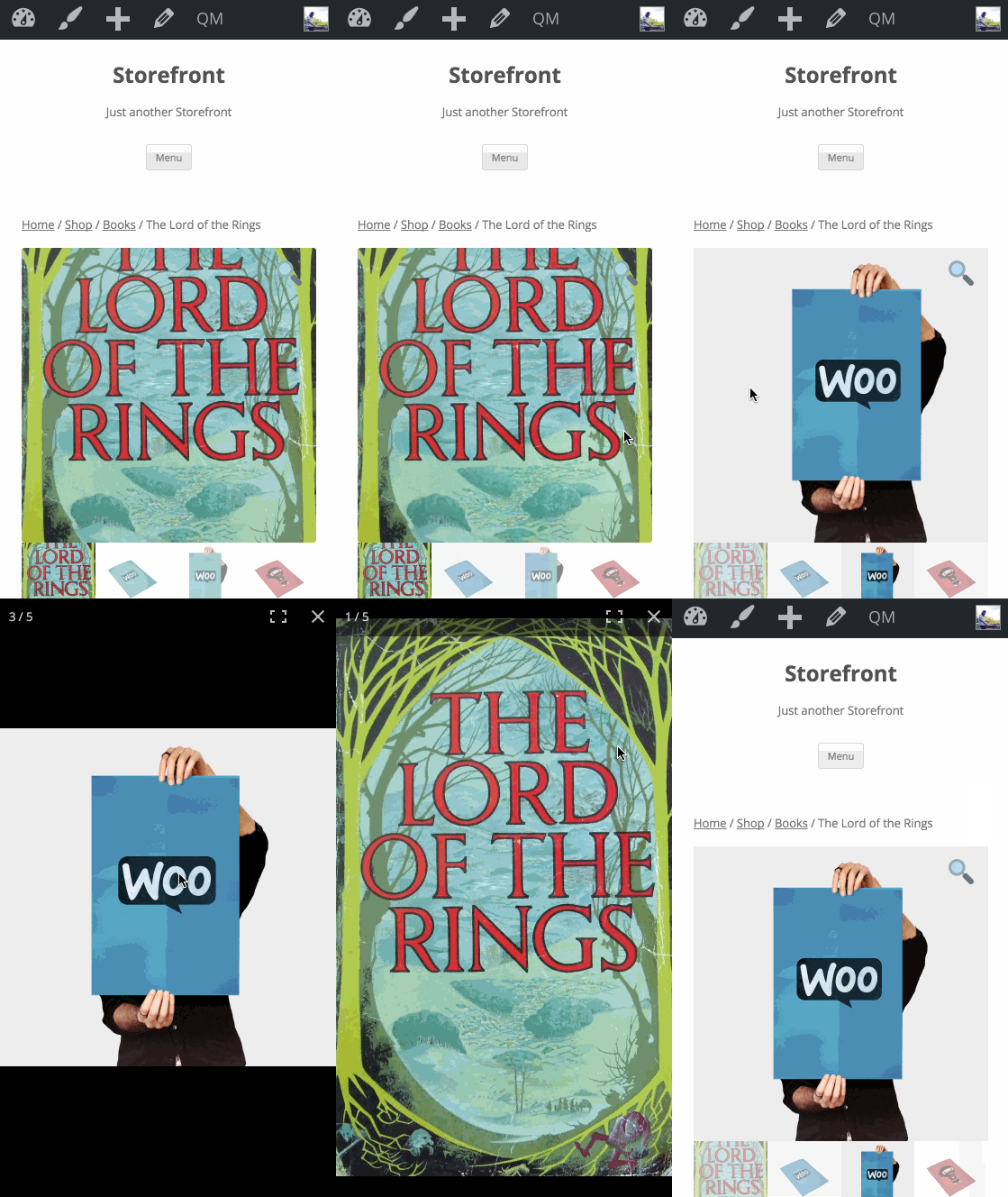
And on mobile;

The (extra) nice thing about the mobile experience (which isn’t possible to capture in a desktop browser), is that you can tap/pinch to zoom once the lightbox is open which makes it feel very ‘native’. You also get to see the full size image, regardless of what size your thumbails display at.
Can I play with it?
You sure can. Just check out the add/product-galleries branch on github. There are a few styling tweaks to work through, and variation images don’t work yet. But you’ll get a very good idea of how things work.
Once again, a note to theme authors
Shamelessly copy/pasted from the previous post;
This change involves template changes to
templates/single-product/product-image.phpandtemplates/single-product/product-thumbnails.phpas well as the addition of some new scripts and a little css. If you dequeue WooCommerce styles in your theme and roll your own, you’ll need to add some css to support the new gallery.
Let us know what you think! 🙂
Leave a Reply