

WooCommerce has always worked a bit like a box of Legos. Core gives you the foundation, and extensions add the pieces — payments, shipping, subscriptions, marketing. That flexibility is the whole point, and it’s why the ecosystem is what it is.
But it has a side effect. When every extension builds its own settings screen, a merchant who installs three of them gets three different ideas of what “settings” should look and feel like. Over the past year, our design team set out to fix that for payments — and in the process we built something bigger: a shared way for any part of WooCommerce, core or extension, to bring its settings onto one consistent, modern foundation.
This post is the design story of that work, and a practical guide you can build to.
The problem: same job, different screen
We started by lining up the settings screens for our biggest payment extensions side by side, and they were all different.
One kept the full site navigation visible inside its own management surface. Another used an older settings menu with a sub-navigation tucked underneath. A third had a clean header with a back control and a Save button. A fourth showed a “Settings” title but dropped other navigation and used its own pattern. The same job, such as configuring a payment method, required four different mental models to learn.
None of them were wrong on their own. Together they added up to a fragmented experience for merchants and a pile of duplicated, divergent UI for developers to maintain. Every difference was design debt and technical debt that someone would eventually pay down.
The principles that guided us
We didn’t want to invent a new settings system. We wanted to find the best pattern we already had and bring everything to it. A few principles carried the work:
- Converge on the best existing pattern rather than inventing a new one. We picked the cleanest, most scalable layout already tested by our internal products, and aligned the rest to it.
- Never break what works. A modern screen should only replace a legacy one when it’s fully ready — and fall back gracefully when it isn’t. No merchant should ever hit a broken settings page because of a redesign.
- One design system, not custom components. Every screen is built from the shared WordPress Design System — the same cards, forms, data views, and tokens used across WordPress. Every custom component you don’t build is debt you don’t take on.
- Consistency is a feature. When settings look and behave the same across extensions, merchants always know where to go when they need help or guidance. They spend less time relearning patterns and more time growing their store.
What unified settings looks like now
Here’s the anatomy of a unified settings screen, top to bottom.
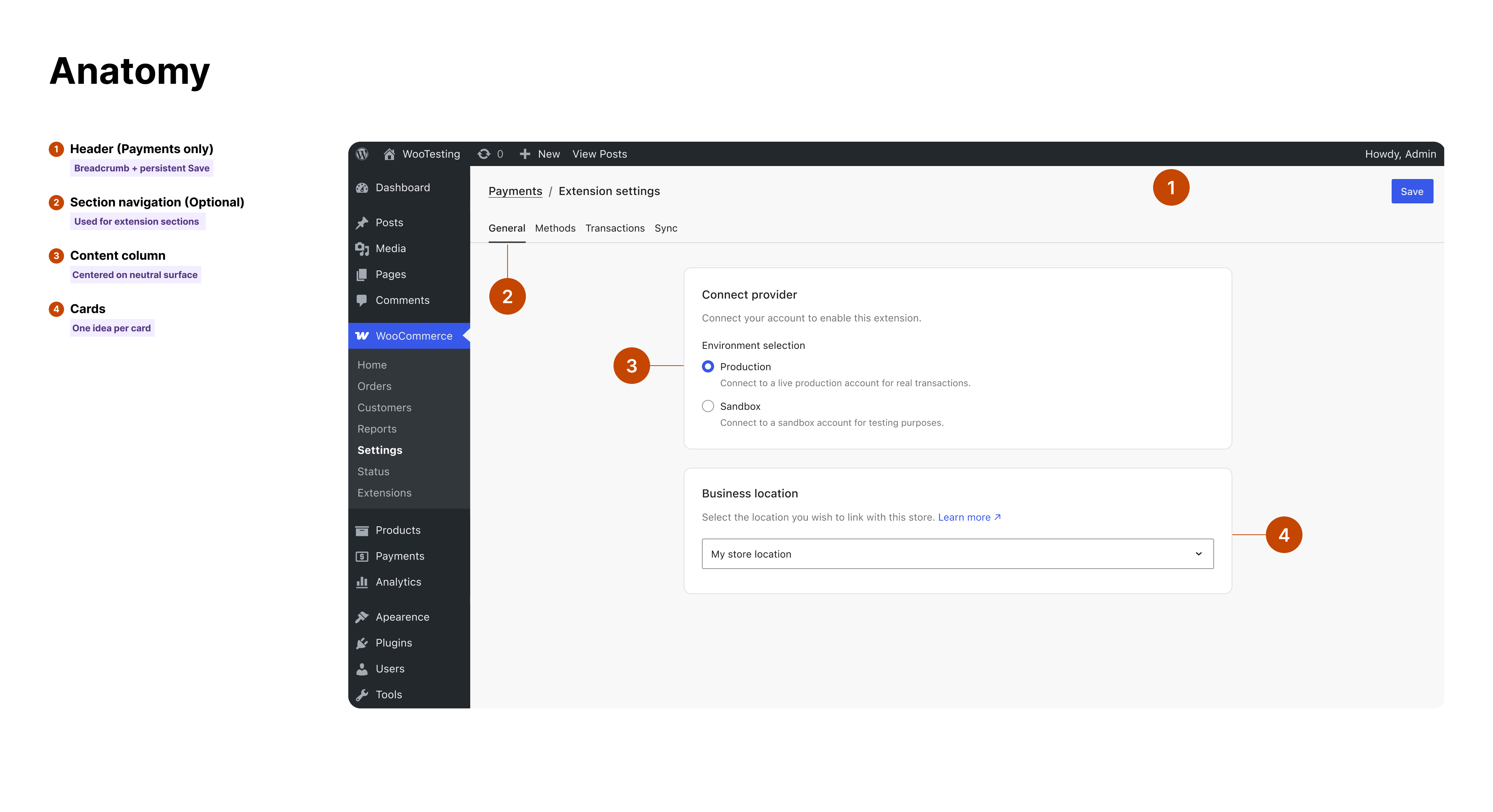
- Header (Payments only). A breadcrumb on the left that shows where the merchant is, and a single Save button pinned to the right. This pattern is only used on payments settings screens that originate from the top level Settings > Payments area. Outside of Payments, the Save button will remain at the bottom of the Settings page.
- Section navigation (Optional). A horizontal row of tabs directly beneath the header for the extension’s own areas — General, Payment methods, and so on as needed — with a neutral divider below it.
- Content column. A single, centered column with a fixed maximum width of 720px, which binds to the
--wpds-dimension-surface-width-xltoken, so every extension’s settings line up at the same measure. - Cards. Stacked surfaces, each grouping one coherent set of settings: a title, a short description, the controls, and any primary action at the bottom.
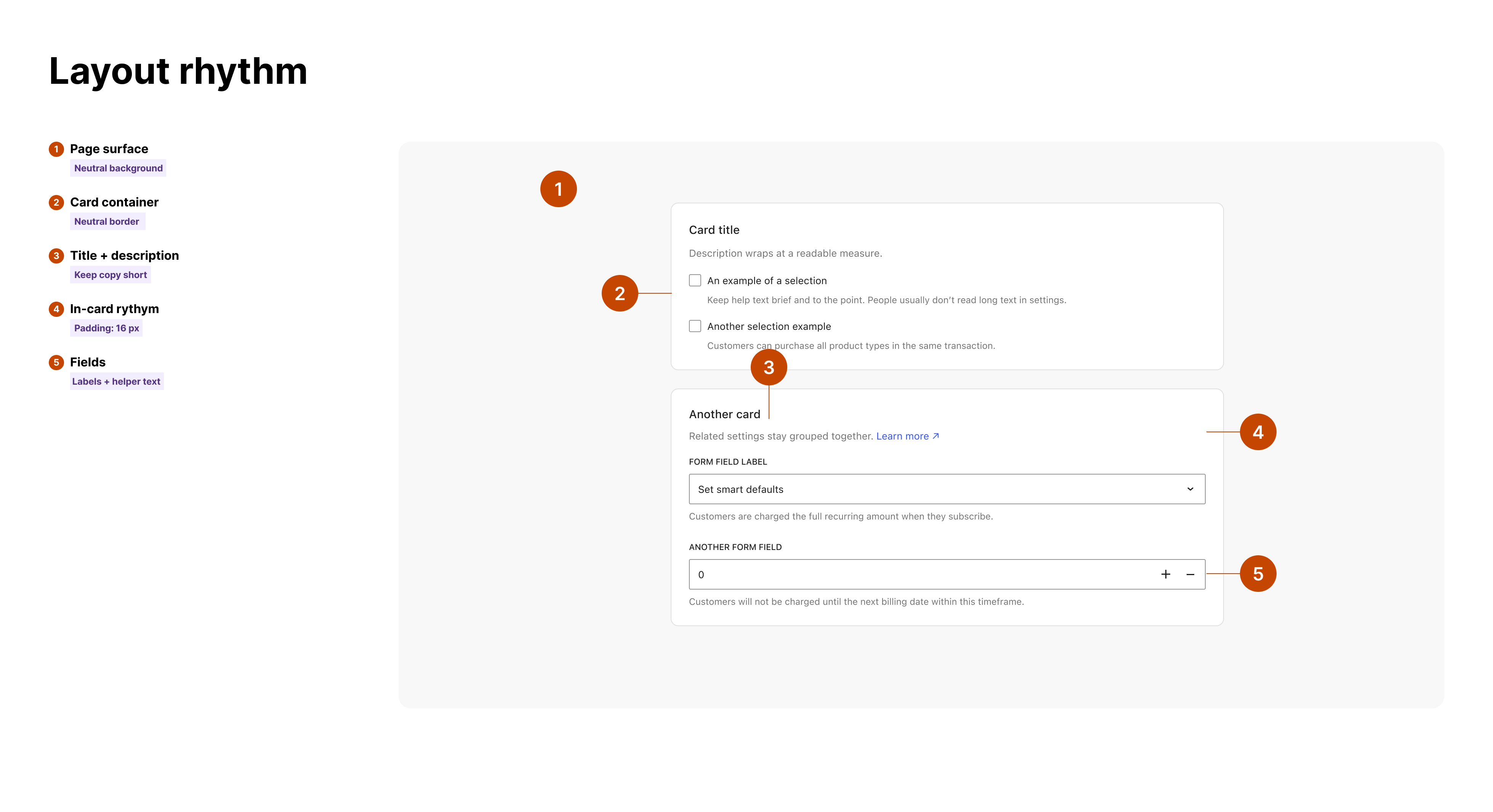
Inside that frame, the details are consistent too. The following are guidelines that comprise the foundation of the Settings UI.
Design guidelines for your extension
By using the new Settings UI, which will be available behind a feature flag starting with WooCommerce 10.9, developers get a lot of these design guidelines ‘for free’. Our developer call for testing and documentation covers the components and adoption steps in detail.
The north star is simple: reach for a WordPress Design System component before you build anything custom, and use design tokens instead of hardcoded values. Concretely:
Layout
- Use a single centered content column using
--wpds-dimension-surface-width-xlas max-width. - Put settings on
--wpds-color-background-surface-neutral, with content grouped into white cards. - Use spacing tokens,
--wpds-dimension-gap-*, and--wpds-dimension-padding-*, not fixed pixels: between cards, inside them, and between a label and its field.
Navigation
- Use the breadcrumb-and-Save header pattern (For Payments only). One Save per screen — a primary
Button— pinned right, that persists as the merchant moves between section tabs if tabs exist. - If needed, use the
Tabscomponent for your extension’s sections. Your tabs are for your areas — they don’t replace WooCommerce’s own settings navigation.
Cards and structure
- Use the
Cardcomponent. One idea per card: a clear title, a one- or two-sentence description, then the controls. - Group advanced or rarely-used settings into a
CollapsibleCardrather than burying them in a long scroll.
Controls
- Use the standard
@wordpress/componentsfor inputs. UseDataViewsfor any table-based UI andDataFormfor generated forms. These handle labels, focus, and accessibility for you. - Reveal conditional fields inline, directly beneath the choice that triggers them. Don’t send the merchant to a different screen.
Typography, color, and tokens
- Map every value to a semantic
--wpds-*token rather than a raw color or size. Text, surfaces, borders, brand color, links, and focus rings all have tokens — use them, and your settings adapt correctly to the current design system theme. - For type, use the
Textcomponents or the--wpds-typography-*tokens. Where you find older, hardcoded values in your code, migrate them to their token equivalents as you go.
Feedback and states
- Use the system’s status tones — success, info, warning, error — for messaging, instead of custom colors. Each tone has a matching surface, stroke, and foreground token. Use
Noticefor in-page feedback andSnackbarfor transient confirmations.
Accessibility
- Keep labels attached to their inputs, never signal state by color alone, and let the standard focus ring render. If you’re adding ARIA attributes by hand, that’s usually a sign you’ve drifted away from the component you should be using.
Useful references
- WordPress Design System Figma
- WordPress Gutenberg Storybook
- WooCommerce Extension UX Guidelines
- Design System Reference Site
The design foundation underneath
The cross-product Forms & Settings atelier shaped this work. This was an internal design effort focused on turning repeated forms and settings problems into shared guidance instead of one-off screens. The goal was practical: define common information architecture, page layouts, component usage, validation patterns, and save behavior that could work across WooCommerce, WordPress.com, Jetpack, A4A, and hosting surfaces.
That guidance shaped the foundation used here. Forms are treated as structured data rather than handcrafted UI, with DataForm and DataViews doing the heavy lifting for layout, controls, validation, lists, and tables. Settings pages use the same repeated anatomy — clear navigation, grouped cards, predictable Save behavior, helper text, and token-based styling — so an extension can fit into WooCommerce without inventing a separate settings app.
The patterns also got tested in real product work before becoming guidance for extension developers. Internal teams pushed them through complex shipping and payment settings, site settings, hosting dashboards, quick-edit flows, validation cases, multiselect fields, card layouts, and local/global save behavior. Each project exposed missing pieces, and those gaps fed back into the shared components instead of becoming local overrides. That loop is what makes this more than a redesign: the guidance came first, real projects hardened it, and extension developers now get to build on the result.
Bigger than payments
We started with payment settings because that’s where the fragmentation hurt most — but the foundation isn’t payments-specific. The same approach will give any part of WooCommerce, core or third-party, a path to bring its settings onto these components without rewriting its pages, and without risking the screens merchants rely on today.
Settings was where we proved it. The same thinking — converge on the best pattern, lean on the design system, never break what works — is how WooCommerce admin becomes one coherent product instead of a collection of screens.
If you build an extension, building to this standard means your settings feel native to WooCommerce from day one, and your merchants get an experience that’s consistent and aligned with the WordPress Design System.
Thanks for reading. We’re excited to see what you build on it.


Leave a Reply